Using Desmos – Transformations of Graphs
By Mark Dawes (January 2019)
If you are new to Desmos you might want to read my earlier blog Desmos – the basics first.
This blog will explore ways to use Desmos (www.desmos.com) to teach transformations of graphs at GCSE and at A-level mathematics. This isn’t a lesson plan but the ideas here could easily be used in lessons; there are a number of different alternatives (such as using sliders, relating graphs to tables and using function notation) that may be appropriate for different classes or at different levels. I have written the things I suggest saying to the class in the form of instructions. There are alternatives that will work as well, so these are merely suggestions.
Starting point: moving graphs up and down
I think this is well worth spending time on, even though it is something the pupils are likely to be familiar with already (from their work with y = mx+c), to enable new links to be made and to explore _why_ graphs move in the way they do.
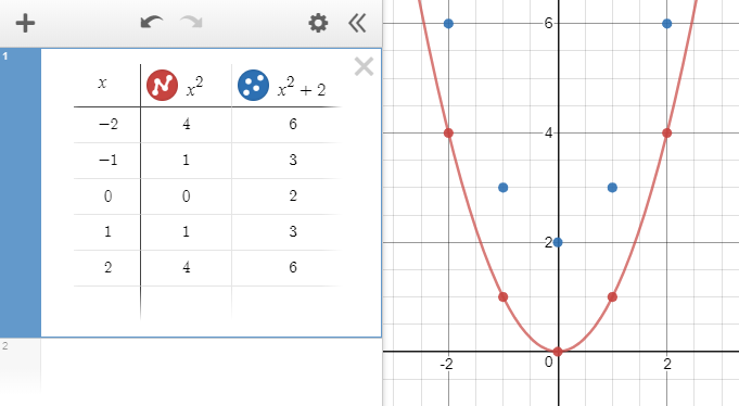
Type in these two graphs. Ask pupils to describe how to turn the red graph into the blue one. Ensure they know that every point on the red graph has been moved up (vertically) by 2. This isn’t always clear: to some pupils the blue graph looks as if it has been made by squeezing the red graph inwards.
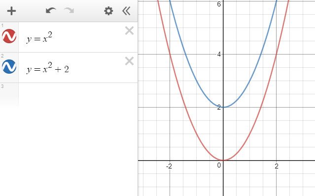
Ask what would happen to the blue graph if the blue equation became y = x2 + 3, or y = x2 – 1 or …. Each time, edit the blue equation and the pupils can see whether they are right.
Now delete the blue graph and click on the cog:
and select ‘convert to table’:
It will now look like this:
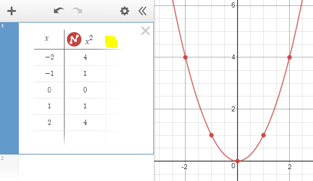
If you click on the part I have highlighted in yellow and then type x^2+2 you will see this:
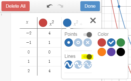
To draw the blue curve, click again on the cog and then click on the blue dot in the table-heading and turn the ‘lines’ button on (highlighted):
Use this to show _why_ the curve has moved up by 2.
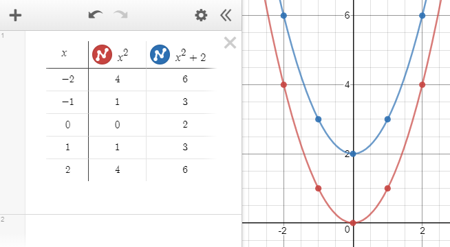
It is rather nice that there are now dots for the points in the table, so we can see more clearly that every point has moved upwards by 2.
Emphasise that for the red graph we calculated x-squared and plotted that against the x-value. For the blue graph we calculated x-squared but added 2 to it before plotting it against the x-value, so the y-co-ordinate of every point is bigger by 2 than it used to be and the graph has therefore moved upwards by 2.
Using f(x)
This can be used as a way to point out some of the power of function notation. It could be used in addition to what has been done previously or instead of it.
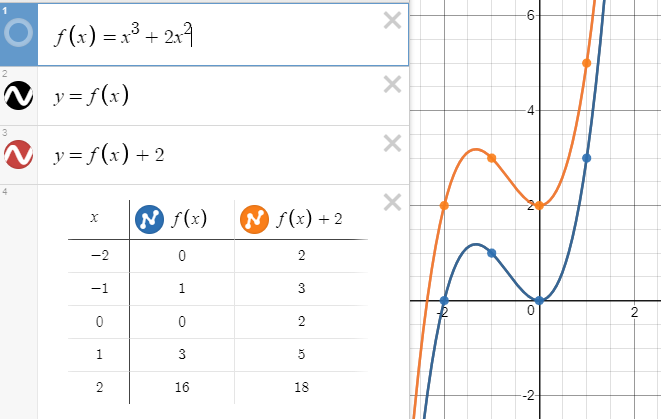
I have illustrated this using the graph of f(x) = x3. As I mentioned in my previous post, one of the few things I dislike about Desmos is that it happily draws the graph of y = f(x) without being asked.
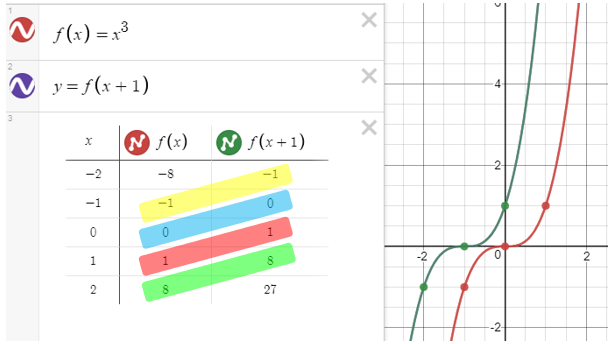
The next screenshot shows a very similar set of transformations, again linking the table of values to the graph (with the table of values being created as above).
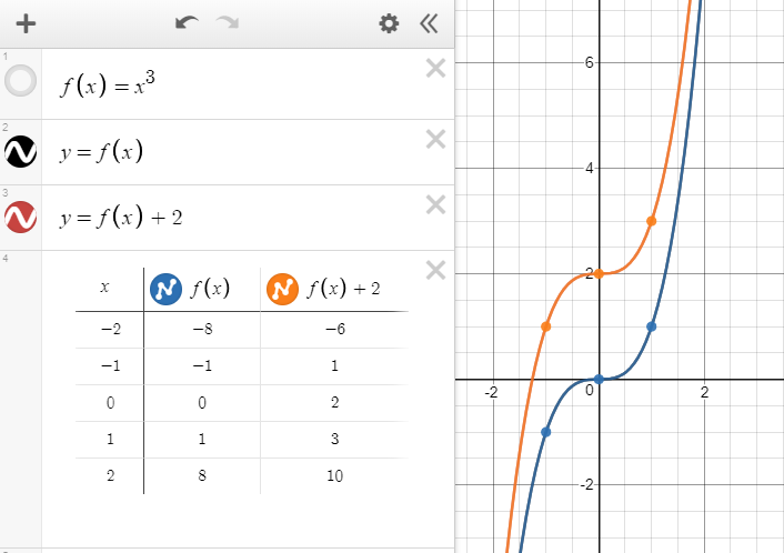
All of the previous things (like changing the ‘+2’ at the end of the table-heading) can be done here too.
One of the brilliant things about this version is that if the original f(x) is changed (for example, to x3 + 2x2, then everything else changes too, including the table and all of the graphs. This can be used to good effect to demonstrate that _all_ graphs move up by 2 when ‘+2’ is put on the end.
Using a slider
If you type y = x2 + a Desmos asks whether you want to ‘add slider’. Just press enter and it happens automatically.
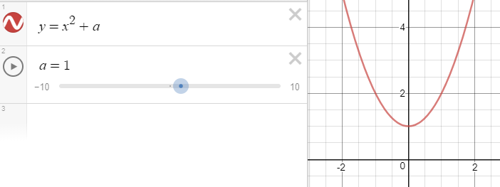
Click on the cog if you want to change the sensitivity of the slider.
This can be used to show the graph moving up and down as the value of ‘a’ changes. It also works well with the f(x) form of the algebra.
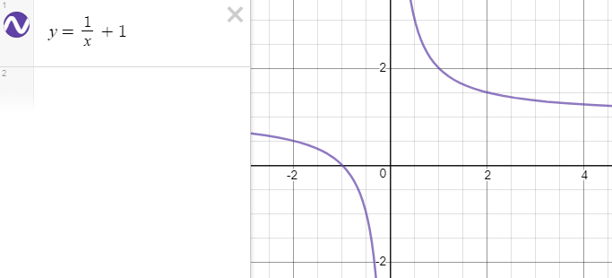
Potential misconception
Do beware that some students get used to the idea that “the number on the end” is the same as “the y-intercept”. For example, in y = mx + c, the ‘+c’ is indeed the y-intercept, and the same is true for y = ax2 + bx + c and for any other polynomial. This is not always the case, though, and that is one reason for choosing to call the slider ‘a’ rather than ‘c’ in the section above. It would be useful to use some examples where the added number is not the y-intercept, such as y = 1/x + 1 (which doesn’t have a y-intercept at all) and y = 2x + 1 and y = cos(x) + 1 (both of which have y-intercept of 2).
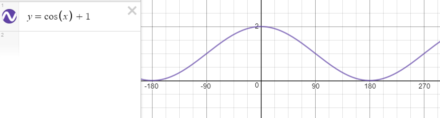
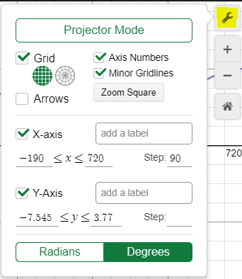
I have included this trig graph as a reminder of how to change Desmos to degrees and to change the scale. Click on the spanner on the right-hand side and change the values as shown:
Moving graphs left and right
To many students it feels as if this version moves “the wrong way”. This next screenshot shows several ideas at the same time. (This can also be done with y = x3 and y = (x+1)3.)
I like to start with something non-standard where there are no repeated values for f(x), to avoid confusion later on. Then get Desmos to create the table as before and draw the curve.
Draw students’ attention to the table. The same values crop up in both columns. Why are they shifted in the way they are? In the original graph, when x = 0 we plot the value of f(0). But in the version with f(x + 1), to get the same y-co-ordinate (which is f(0) in this case) we need x to be -1 and so we need to plot it one place to the left. In the table we can see every time that the values of f(x+1) now appear moved to the left by 1.
We can do many of the same things as we did before, like putting in a slider (perhaps having y = f(x + b) this time).
Hiding the actual function
It can work very well to give students a function that they don’t recognise and to ask them to transform it using their transformation knowledge, without the risk that they will try to substitute or to expand brackets.
Before you start projecting it to the class, at the top of a Desmos file create an unfamiliar function, such as:
Press ‘enter’ a sufficient number of times so the function disappears off the top of the screen.
Now type as shown:
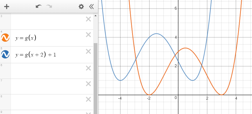
We can clearly see that the orange graph has been moved to the left by 2 and up by 1 to form the blue graph.
Stretching vertically
I have started with f(x) and have drawn the table as well as the graph. For y = 3f(x) what used to be plotted as a y-co-ordinate has been multiplied by 3 before being plotted. This means that anything that had a y-value of zero before still has a y-value of zero, anything that was previously positive is 3 times the size and anything that was negative is still negative but has been multiplied by 3. Everything has been stretched in an up-down direction by a factor of 3: all the points are three times as far from the x-axis.
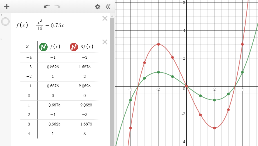
I have extended the table to include more values. This is easy to do: click in the x-column (originally the first value is -2 – click on that) and type what you want. If you press ‘enter’ it creates a new empty row for you to type into.
Potential misconception
I would be wary of starting with f(x) = x2 here. That graph touches the x-axis only once and everywhere else it is above the x-axis. This can lead to the misconception that a stretch pulls the graph _upwards_ only.
Multiple sliders
We can combine all three of the transformations we have looked at so far using multiple sliders (just type the letters: Desmos will add the sliders for you). Do note that our students do not need to combine anything more complicated than these transformations.
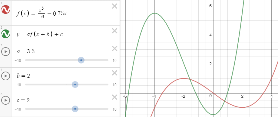
This screenshot shows that it has been shifted left by 2, stretched up and down by a factor of 3.5 and then moved up by 2. (To consider: does the order matter? Sometimes …!)
Squashing inwards
If we transform f(x) into f(2x) it again appears to some students that things happen the “wrong way around” because the graph is “squashed inwards” by a factor of 2.
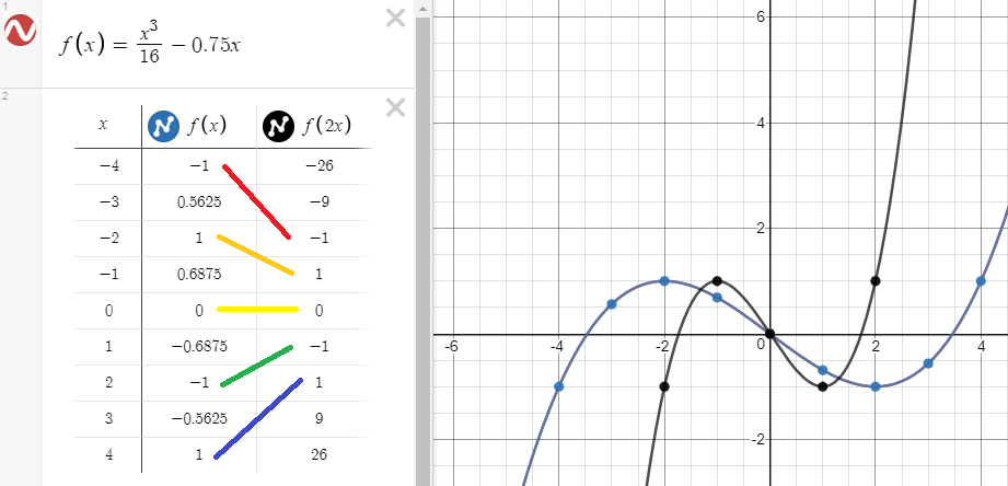
That is because when we plot y = f(2x), what used to be plotted at x = 2 when we had y = f(x) is now plotted at x = 1. For y = f(2x) everything becomes half the distance from the y-axis that it was before.
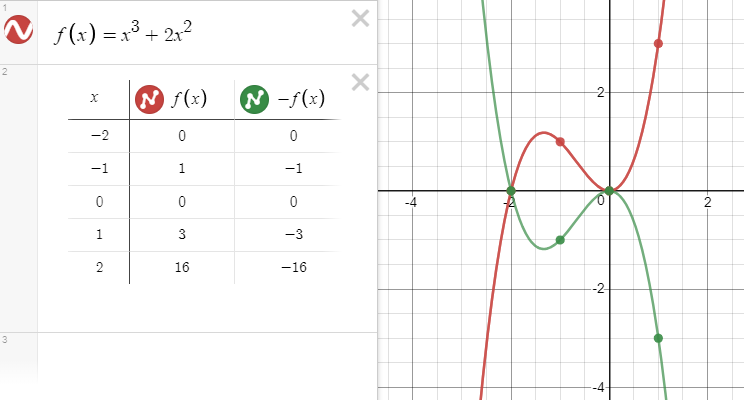
Understanding negatives
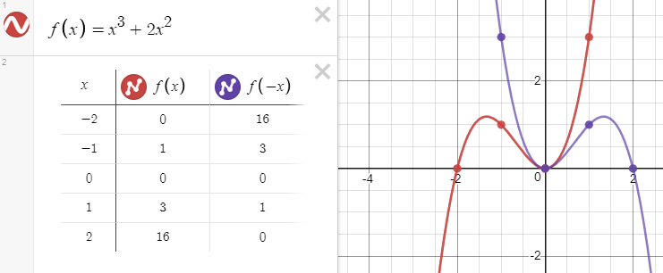
The final type of transformation we will look at is what happens if we have y = -f(x) or y = f(-x). Students often find these confusing, particularly because with certain functions (such as f(x) = sin(x) and f(x) = x3, known as ‘odd functions’) they look the same.
If we compare y = f(x) and y = -f(x) we know that in both cases we are working out f(x), but that in the second case, we don’t plot the value we work out but instead plot the negative version. Again, the table can show this and helps to explain why this gives a reflection in the x-axis.
If we compare y = f(x) and y = f(-x) we can see that what used to be plotted at a positive value of x is now plotted at the negative version of x (and vice-versa). This helps us to see that we are reflecting in the y-axis.
Choose your graphs wisely!
A final thought is that there is too much choice as to which graph to use to demonstrate or to discuss a particular transformation. Do consider carefully which one to use in a given situation. For example: -sin(x) = sin(-x), so that might not be helpful when demonstrating the negative transformations. cos(x) = cos (-x), so discussing reflection in the y-axis using this as a first example might not be helpful (the same is true for x2 and (-x)2).
Trig functions can be helpful for the multiplication transformations, however, given that 2sin(x) looks very different from sin(2x), but might not be as useful for the left-right translation because they are periodic.
Choose well!